Mountaingoat Yoga Logo Re-Design
Branding
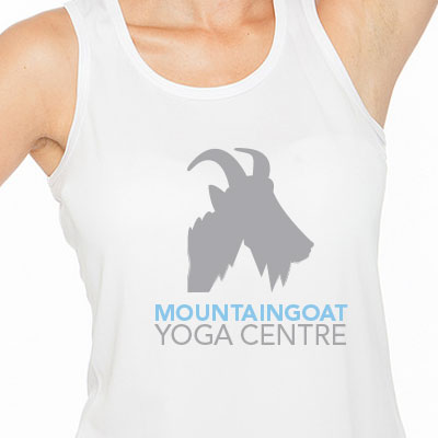
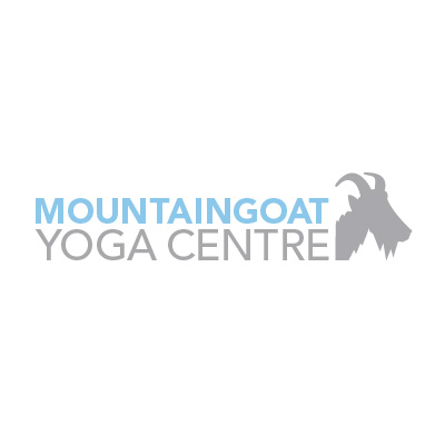
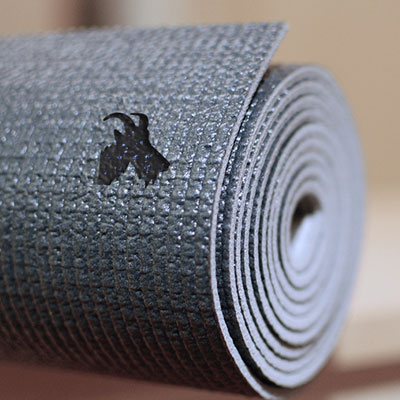
Mountaingoat yoga centre required a logo that was cleaner and that fit the look and feel of their business. To create a calming sensation and relate back to the overall experience in their centre, a lighter grey and blue were used within the design. Along with the calming colour palette, the previous mountain goat theme of the logo was maintained by forming a simplified graphic that could be easily understood. As a final touch, the graphic even shows an interesting hidden and symbolic feature of a mountain that can be seen in the goat’s beard.