Paper Raven Books Logo Re-Design
Branding
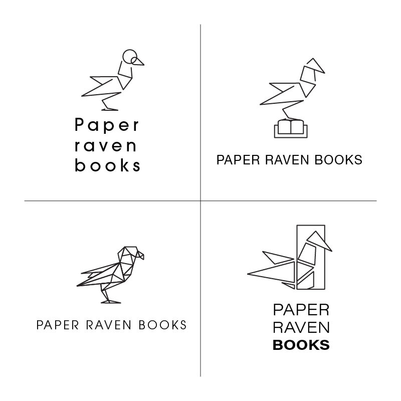
This was a collaboration I worked on with Rachela of Butter & Honey Graphic Design. I was tasked with sketching ideas and creating a series of black and white digital mockups to show. After the mockups, the client chose 1 design and Rachela edited.
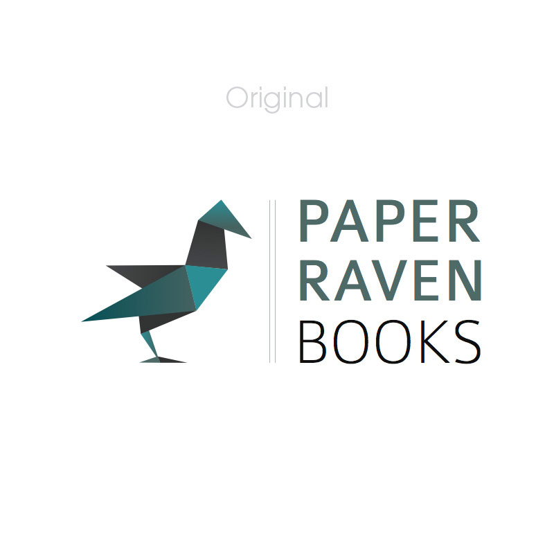
Paper Raven Books is a professional publishing group. They aim to work with entrepreneurs and brands who want to share their stories with the world. For this project, the founder of the business wanted to refresh their original logo into something that was more minimalistic and geometric.
I worked from the original logo and broke apart different areas to create more space. For the minimalistic style, I chose to eliminate solid areas so that the logo would feel slightly lighter. Straight lines were often used to form the origami raven look from the orginal. Once the client looked over a variety of options, they decided to go with the design of the raven resting on the book. The idea of the book was meant to hint at telling those what Paper Raven Books is about.
Additionally, The type was kept very clean and similar to the prior logo design. We used Avant Garde Gothic, which paired nicely with the overall design as it added to the modern and geometric look.
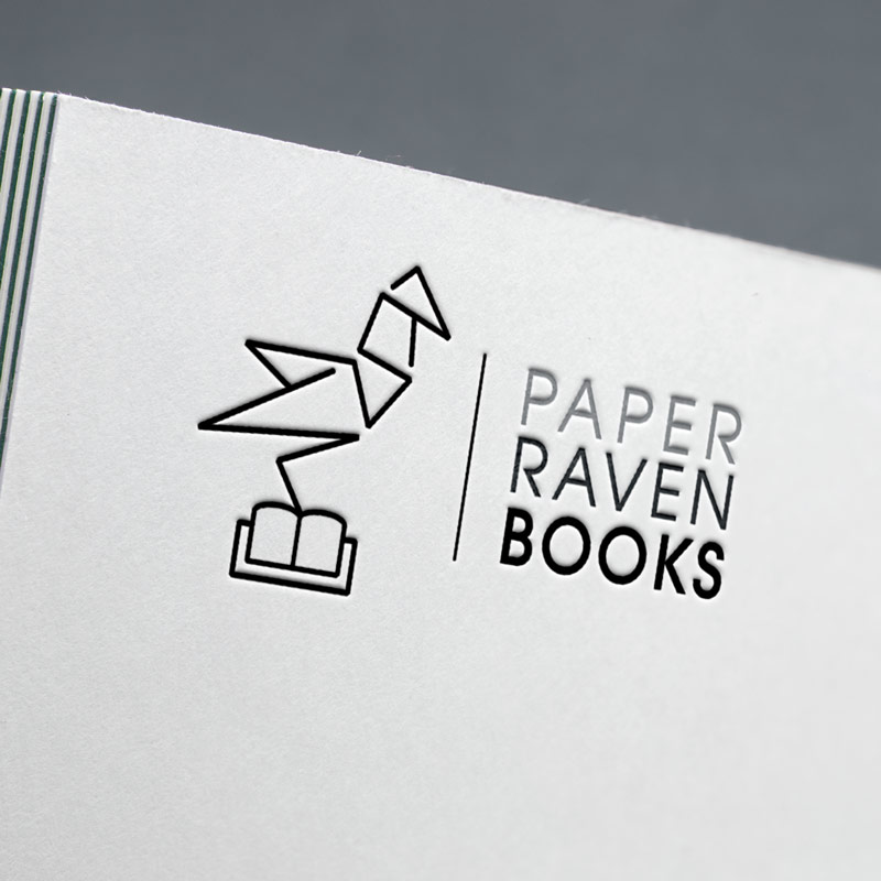
In the end, the client was pleased with their new logo!